
Class Notes: Thursday
9/26/02
- See new "Class Assignments Page", linked from Class Home Page
- Check new material on student pages (from Class Home Page)
- Everybody finished Excel/Histogram Analysis of Study Index Data?
- Everybody has a data set?
Class Assignment 5:
Put some initial analysis on your web page
Revisit Textbook: Cleveland's Visualizing Data
Chapter 2: Univariate Data
Skip:
- Section 2.1: Quantile Plots
-
Section 2.2: Q-Q Plots
Section 2.3:
Box Plots
Idea: Simpler
representation (than histogram) of "data distributions"
Why? Allows
easier comparison of several populations
Historical Note: Invention of John Tukey, who also coined terms:
* "software"
* "bit"
Example from Text (Figure 2.8):
Heights of Singers
Data from New York Choral
Society, background:
Pitch Female Male
Highest Soprano 1 Tenor 1
Soprano 2 Tenor 2
Alto 1 Bass 1
Lowest
Alto 2
Bass 2
Conclusions (without even knowing exactly what the pic is?!?):
- Males are taller than females
-
Lower pitch singers are taller
Details of Box Plots:
+ Main Idea: Simple graphics that shows "where data sit"
i.e. "distribution of data"
(in much less detailed way
than histogram)
Needed Building Blocks: for a given data set,
- median = "point in the middle" =
= number where 1/2 of the data are smaller & 1/2 are bigger
- 1st Quartile = "point at 25% - 75% split =
= number where 1/4 of the data are smaller & 3/4 are bigger
- 3rd Quartile = "point at 75% - 25% split =
= number where 3/4 of the data are smaller & 1/4 are bigger
- InterQuartile Range = 3rd Quartile - 1st Quartile
= "# space on number line from Q1 to Q3"
= a measure of "spread of population"
- Lower Adjacent Value =
smallest value >= (1st Quartile - 1.5 * InterQuartile Range)
(a crude approximation to "smallest number expected")
- Upper Adjacent Value =
largest value <= (1st Quartile - 1.5 * InterQuartile Range)
(a crude approximation to "largest number expected")
- Where did "1.5" come from?
Tukey's suggestion as "usual"
(based on "mound shaped (Normal) distribution")
These are pieces shown in Box Plot (Figure 2.6 from text):
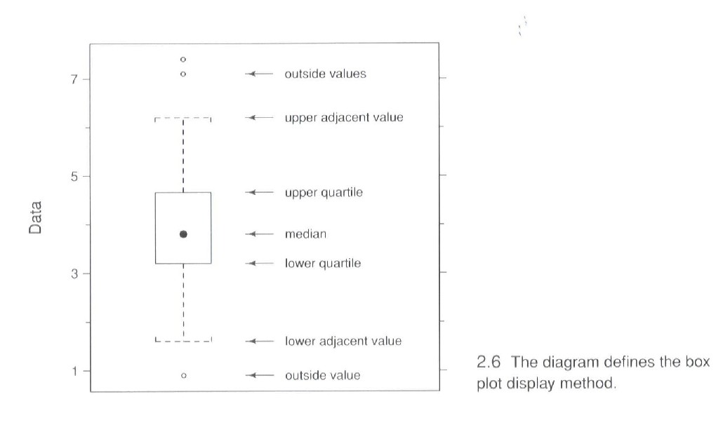
In addition to the above pieces:
-
Data outside the adjacent values are shown as "dots"
Revisit Singer's heights data:
Notes:
- Generally "increasing trend"
- "Spreads" are bigger and smaller "at random" (no apparent system)
- Only once have value outside "adjacent values"
A weakness of Excel for graphical display of data:
Can't do Box Plots (as far as I can see?!?)
Software that allows Box
Plots: Matlab (loaded on your
machine earlier?)
Before learning how to make
Box Plots, let's revisit some earlier data sets:
Proportion Males - Females at UNC:
Recall:
+ Q1: Sample from Class
+ Q2: Stand at doorway and tally
+ Q3: Think up names
+ Q4: Draw random sample
Box Plots:

Show similar lessons to histograms:
- Q1 biased downwards from true value (more females in class)
- Q1 "less spread"
- Q2 biased upwards
- Q2 "more spread" (since wide range of doors chosen)
- Q3 biased upwards (people think of male names more often???)
- Q3 "more spread"
-
Q4 "about right"???
Which display (earlier Histograms, or Box Plots):
- Makes points most clearly???
-
Is easiest to look at???
Study Habits Index (you compared study habits of makes and females)

As before, see:
- Females "better on average"
-
Males "more spread"
British Family Incomes:

Notes:
- See distribution is "far from mound shaped"
- Many data points above "largest expected"
- Box Plot "hides structure" of "two bumps" (visible from histograms)
- Personally: only use boxplot to compare many populations
(all of "simple" structure)
Internet Traffic Data (from Notes 8-20-02):
Study HTTP (Web Browsing) "Response Sizes" (bytes)
- i.e. when you click a link on your browser, how much comes back
- But cumulative over all browsers at UNC
- Four hour period, 1:00PM - 5:00PM, Thursday, April 26, 2001
- First column is "sizes" (bytes)
- Have 6,870,022 data points (will easily gag Excel)

Comments:
- Where is the box?
- Box became horizontal line
- Color is red???
- Because on this scale: Q1, median and Q3 are essentially the same
- Shows that red median line is plotted after blue box
- Main lesson: View is dominated by single large observation
- Again distribution is very far from "mound shaped" (normal)
- Box Plot not very informative, or useful on "this scale"
-
Is there a "better" scale?
Note:
Please bring textbook to class, next Thursday, 9-26-02
Back to Statistics
6D Home Page